This morning I spent some time developing the branded stationary design for the Ross Neil Video Editor client brief (which no, although no longer live [as the design direction took another route for the client], will still be proposed as a live rebrand design).
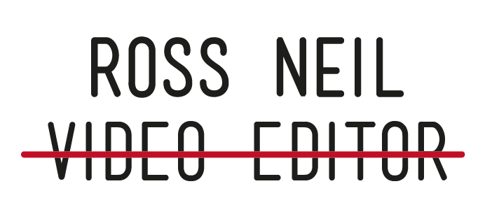
Whilst having a portfolio review as part of my Personal & Professional Practice a couple of weeks ago, the logo and concept behind the development of Ross' brand mark was really picked up upon, and seemed very popular. The idea initially came from the combination of a red progress bar, as shown in many video editing software programmes (of which Ross, and the Video Editing industry utilises), and, of course, scoring a red line through, as if a mistake, from the 'Editing' perspective.
I decided to carry this through the rest of the brand stationary, adding an interesting talking point and consistency throughout the printed brand deliverables, including business card, letterhead, compliment slip, invoice and an envelope design (to the same width of a DL envelope, but with a slightly more unique scale and format to add interest.
I have also ensured consistency in regards to the colour palette, with a red reverse on the printed media, including the red lined envelopes which will help add a real visual strength, and, hopefully, portray and visually communicate the boldness and confidence of both the client and his design portfolio, along with the bold serif type.
Throughout the next couple of days I also hope to go on to design and develop proposals for Ross' web - based presence, including a Twitter, LinkedIn page, and a website, along with taking the brand stationary to print.


No comments:
Post a Comment