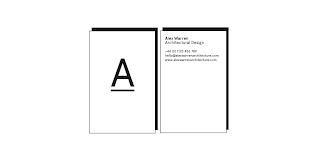
This evening I started work on developing the logo and brand visuals for the Alex Warren Architectural Design brief.
From discussions with the client to date, I've started to establish his tastes in both Architecture, and branding / graphic design, and have found that he is really interested in typographic branding with a clean and minimal outcome. Although his work is relatively contemporary and incredibly innovative, he has stated the fact that he doesn't want to be pigeonholed into a particular style, and aims to keep his portfolio as diverse as possible, not only to be more attractive an employee to future Architecture Studios/employers, but also being more realistic in terms of the work he would carry out on a day-to-day basis.
I've started to experiment with potential design outcomes, keeping it quite simple (a shortlist created, as shown, in the PDF above, to present to the client in a meeting in a couple of days), but still with a nod to a concept and conceptual thinking, of which Alex is so acclaimed for.
What I feel are currently the strongest ideas (shown at the bottom of the page) are the 'A' initial- for both 'Alex' and 'Architecture' and the 'Alexander Warren Architectural Design' logo, which, despite not working very effectively through thumbnails on social media, could look great as a page header or letterhead/business card, with the words balanced on one another as if being built up as a structural form.
The main two typefaces I have explored throughout the initial design are Apercu and Edmondsans, for their contemporary, clean, and yet unique characters (I am particularly fond of the overlapping 'W' which looks like a structural beam of Edmondsans).
Anticipating receiving feedback shortly.


No comments:
Post a Comment